Logos and Beyond
Designing identities, not just logos, and building systems rather than merely following the whims of a trend are crucial. When a company considers designing a new logo, they may want to create a website, prompting their freelancer to ask for a style guide: fonts, colors, imagery, iconography, and a logo that looks appealing on both mobile and desktop. However, many companies find they do not have one.
In search of solutions, companies realize they need not only a logo but so much more, and they may not know where to start. They should consider starting here, understanding logos in simple terms and reconsidering how they think about logos and graphic design more broadly.
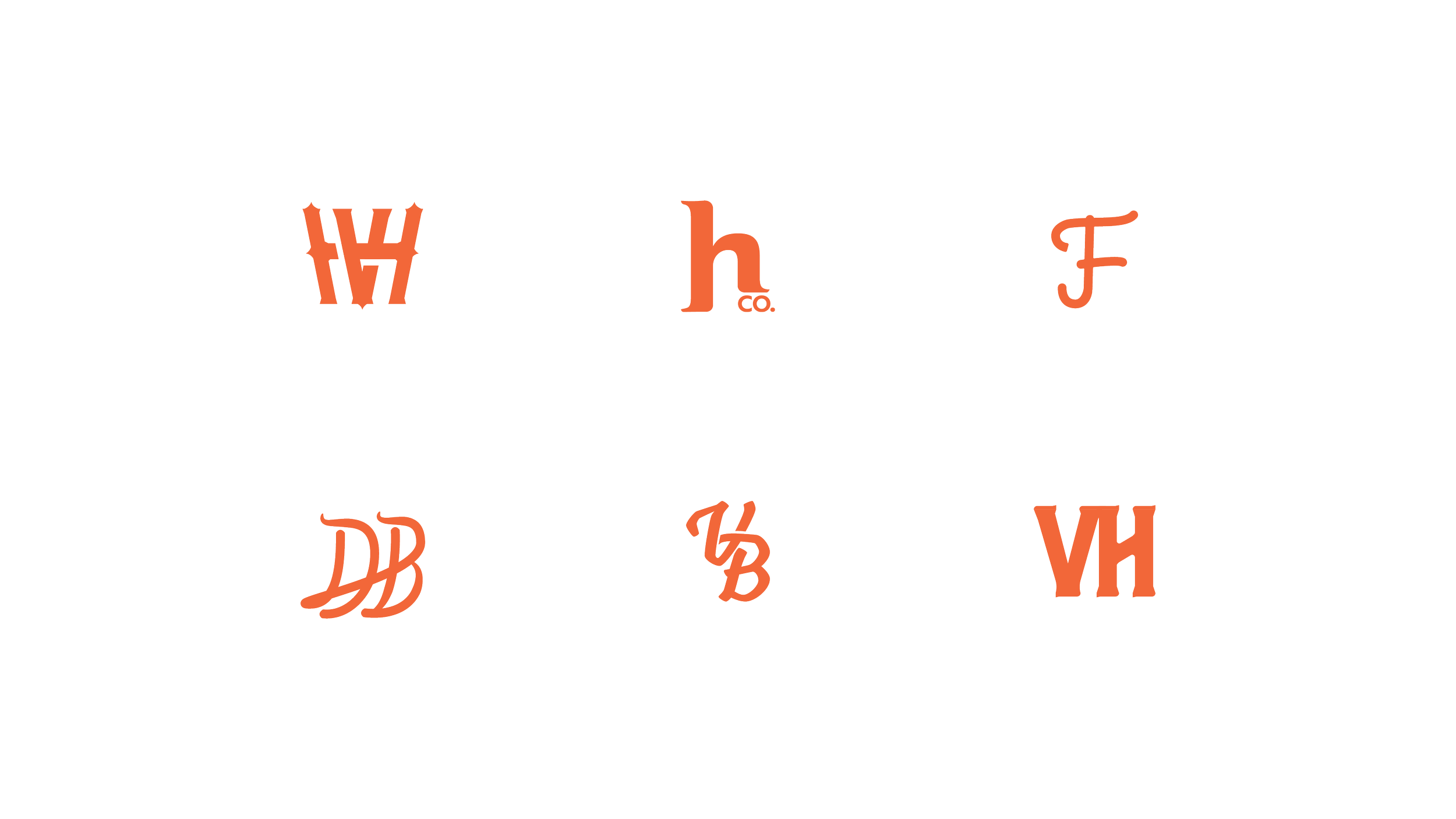
Letter Marks/Monograms
A letter mark is a logo mark made up of two or more letters, while a monogram is a logo mark made up of one letter.
Depending on the brand name, they can fit into a 1x1 ratio, be legible at a distance, and directly nod to the brand name. However, sometimes they can become illegible. One such design was humorously referred to as an “amalgamation of letters” by a friend, but it was an attempt nonetheless.
Letter marks, however, are limiting. If the brand name is long-winded or the letters that make up the brand do not fit well together in terms of composition, other options may be more suitable.
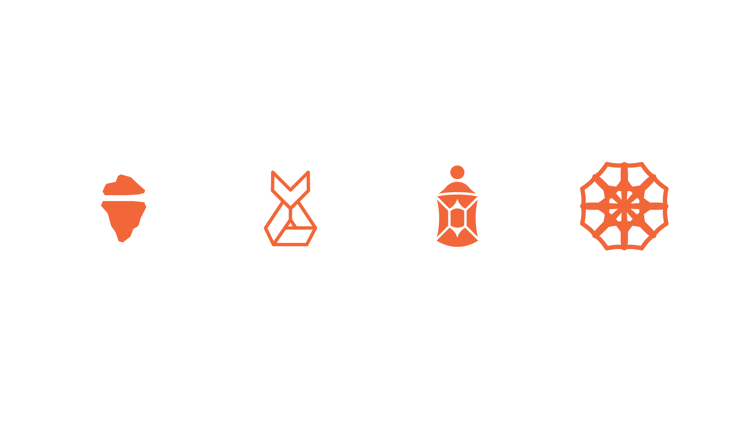
Icons and Marks
The mighty icon is a coveted element for every company, often referred to as a mark. Icons are not illustrations; they are simple marks. Some are abstract, using random geometric shapes, but they do hold meaning. Others resemble objects of focus, such as an apple, a box, or a bird (rest in peace, Twitter).
Icons work when they are recognizable and the audience can associate them with the company. The downside is that if the company is not established enough and the mark is not stellar, people will not be able to see the connection.
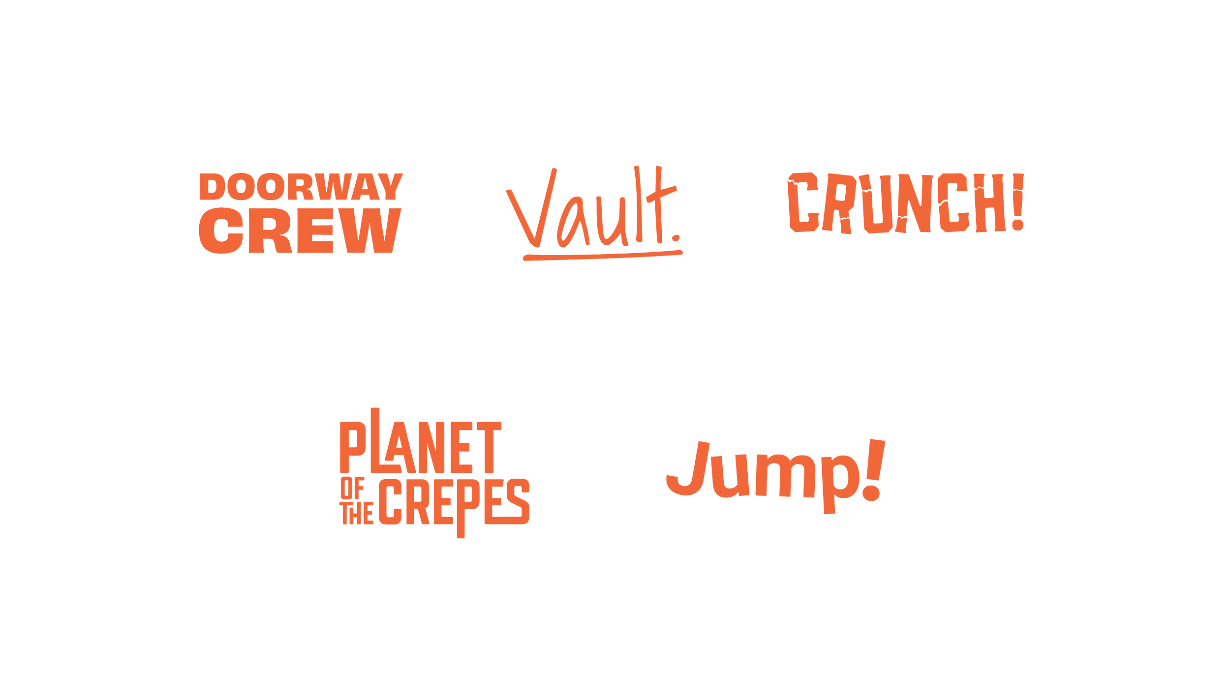
Word Marks
Word marks are the unsung heroes of logo design. A typeface can be customized to look fun, vintage, or abstract, or a simple, clean sans-serif typeface can be used to type the brand name.
There is only one downside to this. Most company names are long and cannot be put into a square format, scaled down, and remain legible. The upside is that nothing is more straightforward than typing the name out, and people do not have to guess to identify the company. However, in a digital world where everyone is on their phones, logos that are identifiable at a smaller scale are a must.
Conclusion
By examining these strengths, companies can address weaknesses. If an icon is not identifiable enough, it may be time to showcase it with a clear word mark of the company's name. For firms used to a wider desktop format, whose clients now use their phones more frequently, web developers and designers might point out that the logo isn't properly optimized. In such cases, creating an icon or letter mark and gradually introducing it in marketing pieces can help make it known to the audience.
A lot of logo problems can be fixed with good public relations (PR). It might not be necessary to discard the entire design. Companies should:
Build brand identity systems, not just logos. Company names should be identifiable with a mark, colors should match the tone, look, and feel of the company, and assets should support the logo, making people think of the company even when the logo isn't present.
Present logos and identity systems more frequently to increase brand awareness.
Ensure visuals are tied back to the brand strategy, avoiding distinctions between how the company sounds and how it looks. Consistency is key in branding. Showing the audience who the company is every day will help them remember it.
Understand that branding is not a one-and-done task; it must be ongoing. Companies should continually build and refine their brand’s identity.