Crafting Vokol: A Brand Identity Odyssey
In 2021, when I came up with the name for what would later become my business, my friend Austin Smith told me, “Imagine 20 years from now you tell someone about this idea you had for a business, and they say, ‘Oh, sounds like a great idea. Did you do it?’ and you respond, ‘No, well I couldn't come up with a name.’”

“Kyle Mack” Logo 2018
2019
We all start out somewhere. “Find a niche,” they say. But like most, I started out showcasing everything I knew how to do, expecting someone to throw a couple of bucks my way. Not a niche. I started out as a street performer—not literally, but it felt like it. I would illustrate, design, and photograph at your first offer, low as it may be. This logo reminds me of a time in my career when I was, as they say, “figuring it out.”
I’ve always liked mountains and I liked photography. This logo depicts my initials in the form of a capture of a mountainscape, a bit illustrative, breaking many modern logo design rules, but simple enough not to look dated. When I first launched my career as a creative, I wanted to do photography, then I wanted to do design, then I did design and photography. Then I wanted to be a designer/coach consultant. Eventually, I discovered this niche industry in graphic design called brand identity design.
Part coaching, part design, and part strategy, brand identity design involves getting to know other people on a deeper level than just simply creating things for them. Over the course of roughly five years, I have helped brands showcase their identities, which has, ironically, left my own brand voice inhibited. Looking at the evolution and exploration of branding as an independent business owner, examining my visual identity while also seeing the strategy behind my designs and brands.
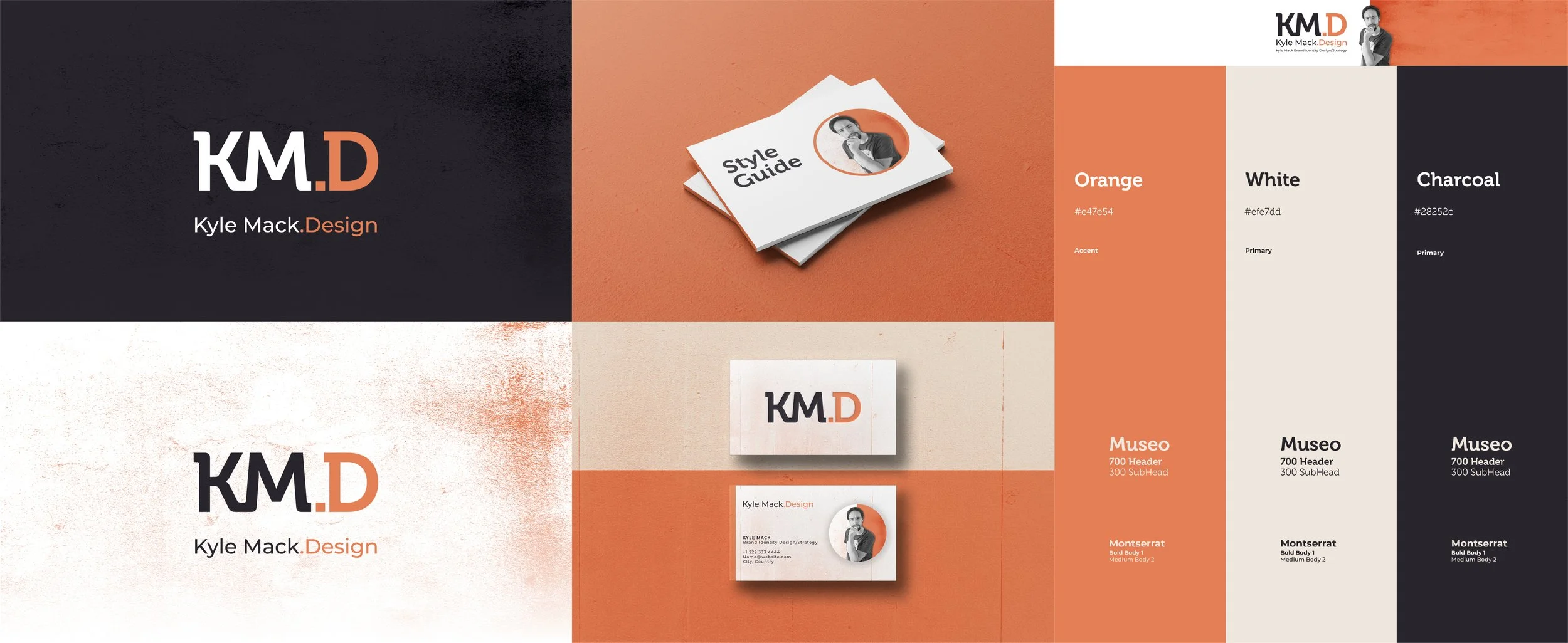
“Kyle Mack“ 2020 Iteration ie, I like orange
2020-2021
I really liked the color orange—so impassioned. During these years, I was greatly influenced by all those carousel-creating brand designers on Instagram during the pandemic. This was when I first discovered I wanted to run my own business.
Orange. Half yellow—youthful, joyful, excited, warm, and half red—passionate, vibrant. This is how I felt. No idea how that would transpire, no plan or purpose. Just full of emotion. All emotion and no purpose. This dream was never sustainable as I would need to rely on my own passion and desires to keep my business going.
My goals and visions as entrepreneur were not bigger than me and, though perhaps I am being uncharitable towards myself, this was also not a true reflection of what my end goal was. Or at least an end goal worth investing time into. I was just kind of doing what everyone else was doing. And as result my brands voice echoed in unison to the white noise of so many others mimicking each other in perfect harmony on social media.
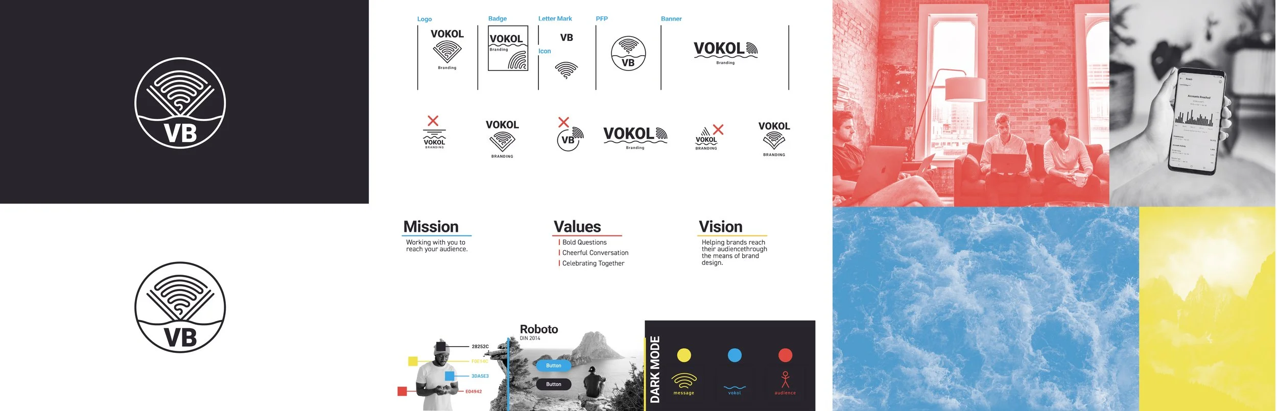
“Vokol Branding“ 2021 Visual Identity
2021-2023
These years were defined by my role as a marketing coordinator. Planned, punctual, and to the point. I wanted my colors to be bold and vibrant primary colors. I wanted to tie my brand back to Christianity.
The word Vokol, the misspelling of the English word “vocal,” paired with the Hebrew word “kol”—meaning distinguished voice. I am not Jewish, but I wanted to play with this idea: God’s voice, when heard, is distinguishable from others when you learn to hear and understand it. Though I am not Jewish, my Lord and Savior Jesus Christ is Jewish, and the books I call Holy (the Protestant Bible) were mostly written by people who are Jewish. This was me paying homage to the historic faith I hold dear. It’s part of who I am, my identity.
Much of brand identity involves the five senses. Marketing, since this was influential at that time, focuses on the sense of hearing. Brands have a voice of their own; they communicate things, they make ripples in the water and send sound waves, and sometimes sound waves come back like echoes. Just like your brand sends out sound waves and people respond back.
Part sound science, part theology, and part industry philosophy. Identity. “This is me,” as I would have thought, and this is who I hope to serve. At this point, I really enjoyed the part of the branding process where I got to hear people’s stories or better their voices.
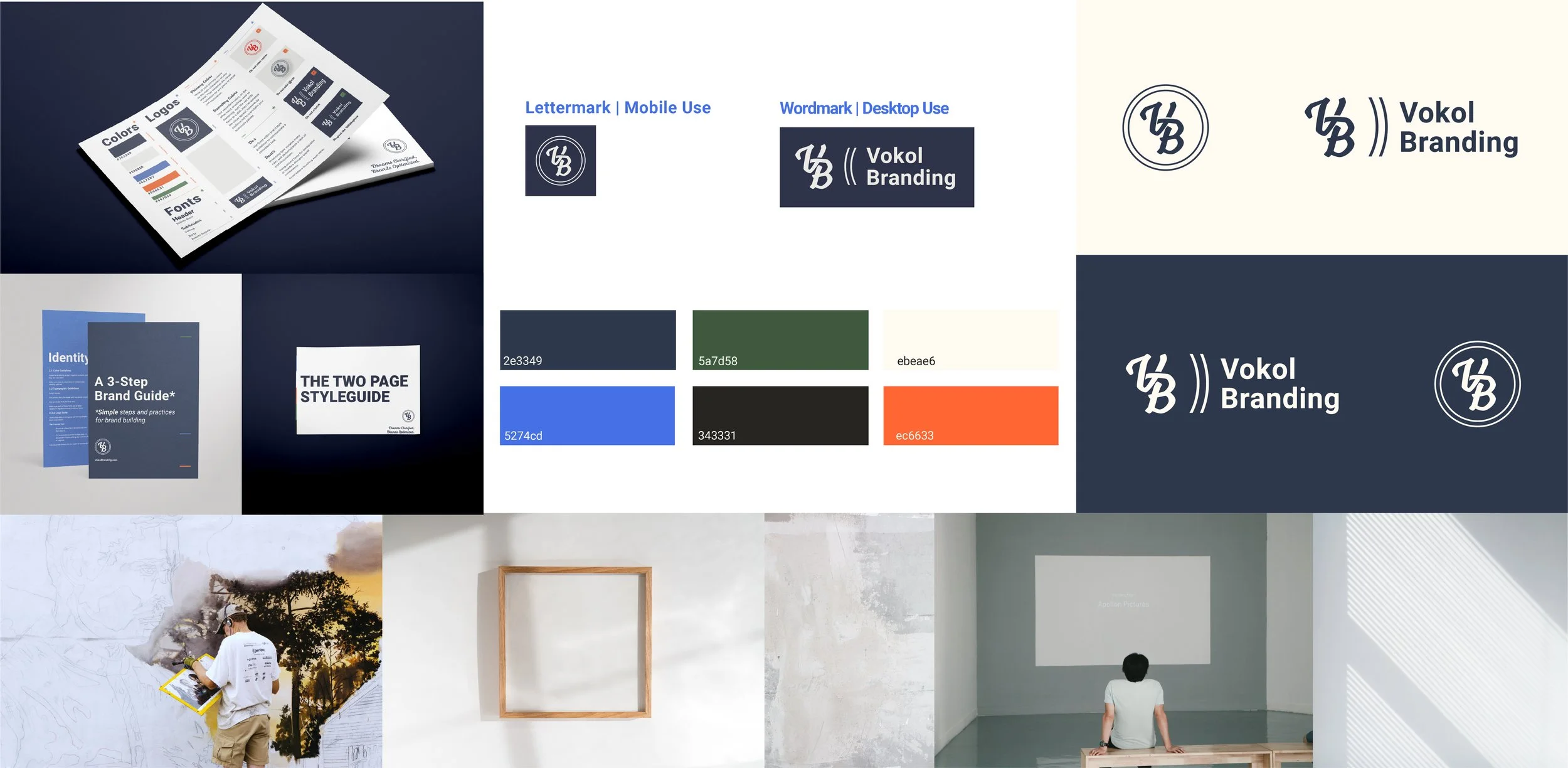
2023 - Present
At this point, I wanted to keep the meaning behind the name and its purpose the same while also making the logo less communication-based and more identity-based, so you guessed it! I created a letter mark again. I was also influenced by my love for all things vintage at this time, special thanks to Christiaan Snedeker, my boss at the time.
I wanted to bring back the orange and make daring color combinations that I felt were very “Midwestern,” as I was born and raised in Wisconsin. I wanted to keep the same minimal design from the initial identity system, letting the colors and fonts breathe without conflicting with complex imagery. I like a clean and organized room.
I had this philosophy worked out two years ago for the name Vokol, but I didn't have a tagline or trueline statements to tie the ideas to my services. So in 2024, it came to me: “Dreams clarified, brands optimized.” Vokol has always been about clarity—shaping the voice, making it clear, and improving it over time to make it work better, to optimize it. What is someone's voice but simply their dreams and passions put out into the world, heard by others? They either respond or they don’t.
Epilogue
My brand voice is but an echo of so many other small business owners and entrepreneurs who have dreams. It exists for you.
Your brand is also FOR others. I get it, the logo you have right now might not be satisfactory or perfect, the messaging, colors, or everything else may not be completely “you” or your audience for that matter, but that doesn't mean it isn't an important piece of your story that won’t lead to something greener and brighter in the future.
Our brands are much bigger than us and our dreams. It’s the dreams of others, our communities, our cities, and our homes.